

Over the past few days, while participating in the review process for designing a help center, I’ve encountered several questions: What exactly is a help center for? What should a help center help users with? Should we fully capitalize on the traffic if the help center gets a lot of it? Should a help center include a UGC module? This blog post records my thoughts and design process for a help center, hoping it can be helpful to everyone. If you have different opinions, feel free to point them out and discuss them.
#What Exactly Is a Help Center For?
銆€ 銆€Looking at the current design of help centers on major websites, the help center is an important part of a site, but it is invariably downplayed during UE and UI design. What exactly is a help center for? I personally believe that a help center is designed to solve specific problems when users encounter them; it doesn’t need to be as comprehensive as a product manual, exhaustively explaining every function of the website. Currently, help center content falls into two main categories: 1. Function-based navigation; 2. Usage instructions.
#How Should a Help Center Help Users?
銆€銆€Based on current usage habits, help centers are mostly used by novice internet users, especially on e-commerce sites, for those who aren’t very familiar with online shopping or when a site’s entire purchasing process is unique and requires separate explanation. Personally, based on my own usage habits, I have never actively visited the help center of any major website. So, how can we better assist novice internet users?
1. Function-Based Navigation
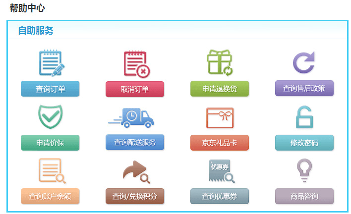
銆€ 銆€When users want to perform an operation within a specific part of the shopping process but don’t know where that function is, the help center homepage serves as a good navigation tool. Take the JD.com help center homepage shown above as an example. JD.com, a representative B2C website, divides its help center’s function-based navigation according to the three basic e-commerce modules: pre-sales, during-sales, and after-sales. JD.com reorders these three modules based on the content users care about most: the first column is after-sales, the second is during-sales, and the third is pre-sales.
2. Usage Instructions
銆€銆€Usage instructions can be further divided into two types: 鈶?Process/operational guides, 鈶?Text-based explanations.
鈶?Process/Operational Guides

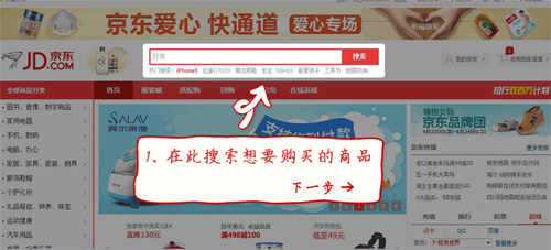
銆€ 銆€These mainly explain the website’s entire purchasing process, from registration to the final purchase completion, returns, and exchanges. As shown in the image above, the JD.com help center homepage sorts its site operation guides in the order of pre-sales, during-sales, and after-sales, introducing the functions of each module. When you click into a section, JD.com uses intuitive operational diagrams for display, without lengthy text explanations, making it clear and visual. This is very easy for novice users who need the help center to understand.
鈶?Text-Based Explanations


As shown in the images above, the design thinking here applies to features like Alipay that require specific explanation but cannot be summarized in just a few words, yet are important enough that users must know what this function or module does. Examples shown above include the introduction to Alipay’s Yu’e Bao earnings and JD.com’s 211 Limited-Time Delivery service.
#Should You Capitalize on High Help Center Traffic?
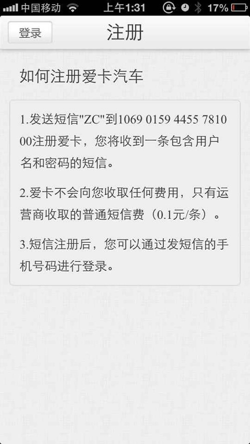
銆€ 銆€My current view is that if a help center accounts for a significant proportion of a website’s traffic, that represents a failure on the part of the site’s product manager. According to current product design philosophies, if a product cannot be used easily right out of the box and requires users to consult a help center or manual, I consider that product a design failure. For example, consider Xcar. The user registration process could be designed in a much smarter way; forcing users to manually send a text message to register is completely unnecessary, adds difficulty to the registration process, and is worse than having no feature at all 鈥?all accompanied by large blocks of text explanation. (Image from @XunShaohua’s Moments)
#Should a Help Center Include a UGC Module?
銆€ 銆€Many people think that if a help center has traffic, we