

Responsive design aims to provide the optimal visual experience for each website on different devices. So how can you tell whether a website adjusts automatically based on the device? That requires designers to test the site’s responsiveness. This article introduces 15 of the best responsive website testing tools. They can help you check whether your site’s design responds gracefully to various devices, and assist you in designing websites that adapt to devices of different sizes and operating systems.
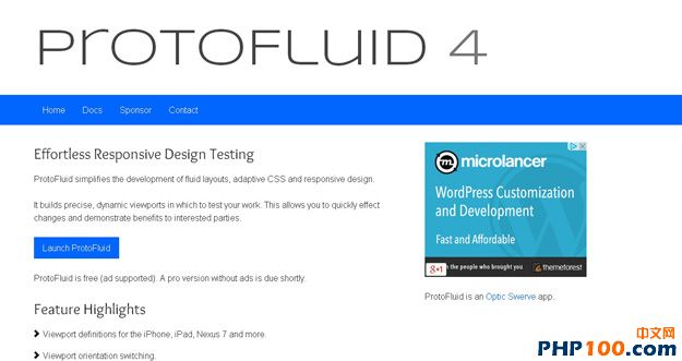
ProtoFluid simplifies the development of fluid layouts, adapting to CSS and responsive design, and builds precise, dynamic viewports. Developers can use ProtoFluid for free, and it also allows the use of other extension tools, such as FireBug.
Viewport Resizer is a browser-based testing tool that can test the responsiveness of any website. Users simply drag the webpage into their bookmarks, then click on the page they want to test to check its screen resolution. Moreover, the built-in resolution sizes may not always meet your needs, so users can also add custom screen sizes of other types.
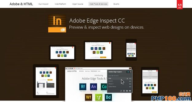
Users simply enter the URL to be tested, and the webpage automatically resizes based on the device you select.
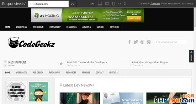
4.Respondr
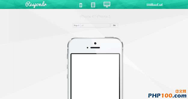
Respondr is a lightweight, very handy and compact tool. Users just enter the webpage’s URL, then select the device they want to test, such as iPhone, iPad, or desktop browser, and they can immediately see how the page displays on different platforms.
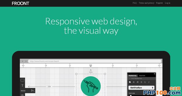
5.Froont
Froont is a web-based design tool that requires no programmer intervention, providing designers with a visual online webpage design environment.
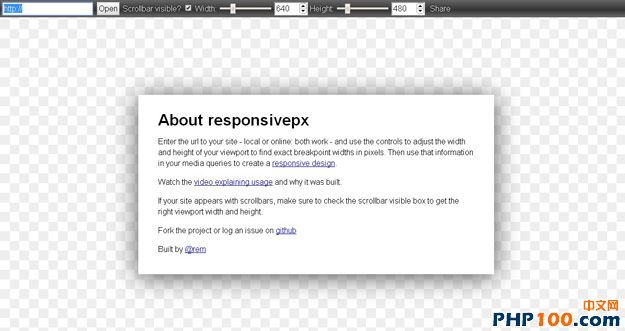
Responsivepx is a simple yet very convenient and practical testing tool that can test how a webpage appears on displays of different sizes. Furthermore, Responsivepx lets you adjust the display dimensions by setting width and height px values. Users can test online or locally on their own machines.
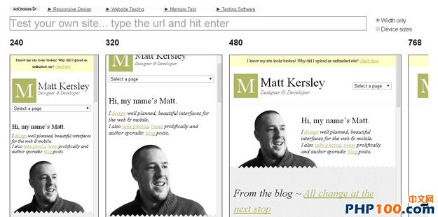
Responsive lets you see how a tested website displays at different resolutions on the same screen, without needing to switch between modes.
Screenfly is a free testing tool that can test how a website appears on different clients (various displays or mobile devices).
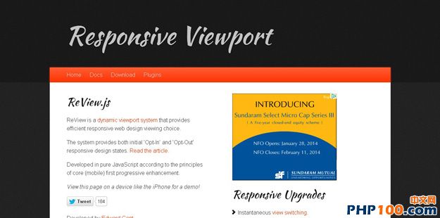
Review.js is a dynamic viewport system that provides efficient responsive web browsing options. It is a pure JavaScript library, and fewer requests mean lower bandwidth requirements. It supports plug-in extensions and custom window resize events. Additionally, the system offers ‘Opt-In’ and ‘Opt-Out’ responsive design states.
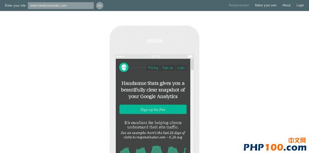
Responsinator provides a simulated web interface to test your responsive design, offering previews on iPhone, Android, iPad, Kindle, and many other devices. You can conveniently see how your responsive design renders on devices you need to support.
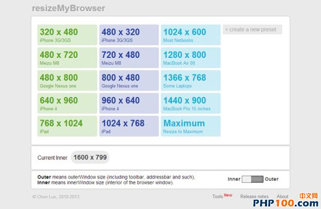
resizeMyBrowser is a responsive web design tool that lets you choose the browser size to test. Users can select from 15 different preset sizes or enter a custom dimension.
12.Responsive Design Bookmarklet
Responsive Design Bookmarklet is a responsive design testing tool. Users need to drag the webpage to the bookmarks bar above, and the browser will apply it automatically. Users can then preview how the webpage looks on different devices.
Adobe Edge lets you preview and inspect responsive websites on devices.
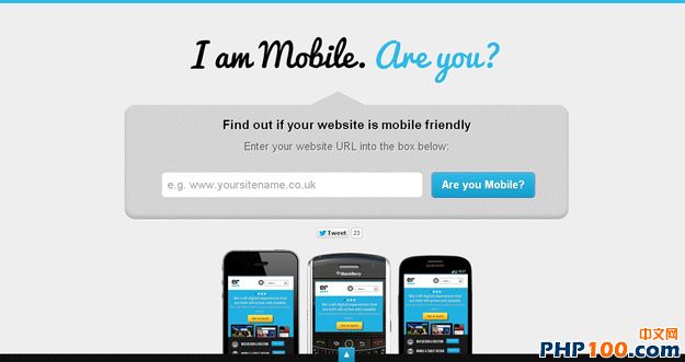
14.I am mobile
I am mobile can test how a webpage appears in various window sizes and also provides suggestions to make your website more mobile-friendly.
Retina Images is mainly used to test how images display on different devices, helping users develop high-definition images. Furthermore, you don’t need to change any img tags, and Retina Images is also very easy to install.

Unless otherwise stated, all PHP100 news articles are original or contributed reports. Please credit the author and provide the original link when reposting.
Original link: http://www.php100.com/html/it/mobile/2014/0211/6533.html