

Foreword: With the increasing popularity of mobile devices and the advancement of web technologies, the demand for cross-platform web development will continue to grow. How can we adapt interfaces across multiple devices? We can use CSS3 Media Queries to achieve this. This article mainly introduces examples of combining mobile development with CSS3 to adapt to various resolutions.
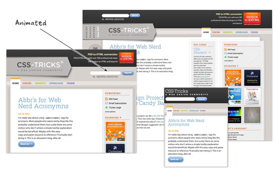
The concept of responsive web design mentioned in this article is a modern web design approach. Based on the CSS3 Media Query feature, it enables web pages to adapt to different devices, meaning they automatically rearrange their layout according to the device’s resolution and scaling.
———–
Translated from: http://webdesignerwall.com/tutorials/responsive-design-in-3-steps
Reprinted from: Jiang Yujie’s Blog (http://blog.csdn.net/hfahe)
Responsive web design is undoubtedly a huge deal right now. If you are not yet familiar with responsive design, check out the list of responsive sites I recently published (Translator’s note: Take a good look at how the example websites display across different resolutions). For newbies, responsive design might seem a bit complex, but it’s actually simpler than you think. To help you quickly grasp responsive design, I’ve drafted a quick tutorial. You can learn the basic principles of responsive design and Media Queries in just 3 steps (assuming you know basic CSS).
Step 1: Meta Tag (View Demo)
Most mobile browsers zoom out HTML pages into a wide viewport to fit the screen resolution. You can use the viewport meta tag to reset this. The viewport tag below tells the browser to use the device’s width as the viewport width and disables the initial zoom. Add this meta tag inside the <head> tag.
- <meta name="viewport" content="width=device-width, initial-scale=1.0">
IE8 or older browsers do not support Media Queries. You can use media-queries.js or respond.js to add Media Query support for IE.
- <!–[if lt IE 9]>
- <script src="http://css3-mediaqueries-js.googlecode.com/svn/trunk/css3-mediaqueries.js"></script>
- <![endif]–>
Step 2: HTML Structure
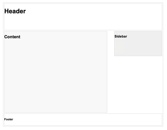
In this example, I have a basic page layout consisting of a header, content, sidebar, and footer. The header has a fixed height of 180 pixels, the content container is 600 pixels, and the sidebar is 300 pixels.
Step 3: Media Queries
CSS3 Media Queries are the core of responsive design. They tell the browser how to render the page for a specified viewport width based on conditions.
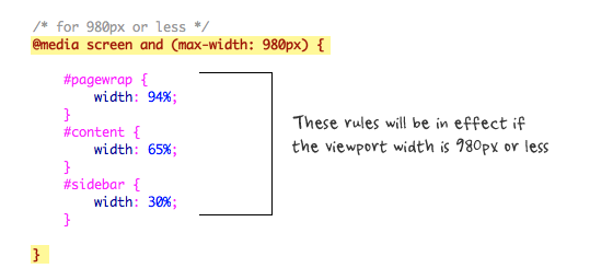
When the viewport width is 980 pixels or less, the following rules will take effect. Basically, I will change all container widths from pixel values to percentages to make the containers fluid.
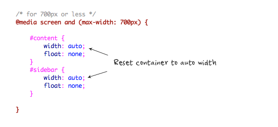
Then for viewports less than or equal to 700 pixels, specify the #content and #sidebar widths to be flexible and clear their floats, causing these containers to display at full width.
For situations with a width less than or equal to 480 pixels (mobile screens), set the #header element’s height to auto, change the h1 font size to 24 pixels, and hide the sidebar.
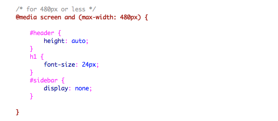
You can add as many media queries as you like. I’ve only shown 3 media queries in the demo. The purpose of media queries is to specify different CSS rules for designated viewport widths to achieve different layouts. Media queries can be written in the same or separate stylesheets.
Conclusion
This tutorial is meant to show you the basic principles of responsive design. If you want more advanced tutorials, check out my previous tutorial: Responsive Design with CSS3 Media Queries.